
A reliable logo placement guide for corporate gifts starts with use, not a catalogue image. Identify who should see the mark, examine every state the product enters and choose a surface that remains visible, stable and producible through those changes. Then define the position from a fixed physical datum, exclude construction and handling zones, and test the decision from real viewing angles. There is no universal best side, size or offset: a bottle rotates, a polo folds and moves on the body, and a tech pouch may be packed, opened, carried or laid on a table. The correct placement is a product-specific decision supported by drawings, physical checks and evidence from the intended production route.
Walk Through the Object Before Placing the Logo
Start with the viewer, not the artwork
First decide whose view matters when the gift creates value. The recipient's view while opening it may differ from a colleague's view across a meeting table. A camera used for an onboarding photograph sees another angle again. Record the primary viewer and the intended encounter: unboxing, carrying, wearing, drinking, desk use, presentation or storage.
This prevents a familiar approval error. A logo can appear prominent in a flat mock-up yet disappear behind a hand, under a flap or around the far side of a curved object. “Front” has meaning only after the product orientation and viewer are defined.
For an international B2B programme, distinguish the buying team's presentation view from the recipient's use view. Procurement may approve an image showing the product upright and isolated. The user may encounter it lying beside a laptop, worn under a jacket or held with either hand. Both views can be valid, but the brief should state which one governs.
Inspect every product state
Walk the item through five states: packed, open, resting, held and assembled. Not every gift uses all five, but the sequence exposes changes that a single beauty shot cannot.
In the packed state, ask whether packaging hides or reframes the mark. In the open state, check whether a lid, zip, fold or insert crosses the viewing path. At rest, let the product settle naturally rather than forcing it into its most flattering orientation. In the held state, use the grip a person would actually choose. In the assembled state, attach the cap, cable, strap, stand, sleeve or other component supplied with the gift.
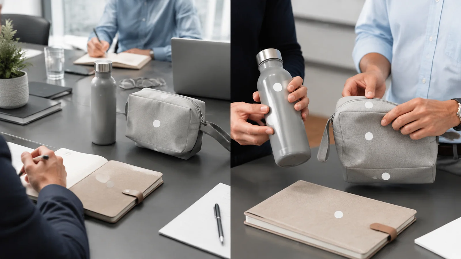
Photograph the object at each transition. The purpose is not to create marketing imagery. It is to find occlusion, rotation, inversion and competing features before production.
Read the surface as a physical system
A printable-looking area is not necessarily a dependable logo surface. Curvature changes apparent proportions. Soft panels distort when filled. Garment fabric shifts around seams and the wearer's body. A rigid pouch may have an internal frame that is invisible in a front photograph. Product moulding, supplier marks, pockets, zip paths, handles, ribs and hardware all influence what the viewer sees and what production can reach.
Supplier drawings are useful inputs here. SanMar explains that its product-specific decoration sheets use line art to identify seams, pockets, common placement areas, measurements and possible production concerns. Crucially, SanMar calls the recommendations a starting point and says equipment, expertise and method can change what is feasible. They are guidelines for particular products, not universal rules to copy across a category (SanMar).
Treat the blank product as geometry first and branded merchandise second. Selection of the marking process comes later; if needed, use LUGVO's guide to branded merchandise decoration methods without turning a placement review into a technique comparison.
Convert the Walk-Through into a Placement Map
Anchor the position to a fixed datum
A placement instruction should refer to a feature that production can identify consistently. This is the fixed-datum principle. Possible datums include a centre seam, zip end, pocket edge, mould line, collar join, panel boundary, base feature or permanent manufacturer mark. “Visually centred” is not a datum. Neither is “front” when a component rotates.
Choose a datum that remains part of the same component as the logo surface. If a bottle lid can stop at different rotational positions, the lid feature is not a reliable reference for artwork on the bottle body. YETI Europe describes one specific example: its straw and chug caps are not “docked” to align with a fixed point on the bottle. The same supplier says artwork in its personalisation workflow is centred within the available marking area, excludes its existing product mark from that area and can be previewed in a proof (YETI Europe). Those are supplier-specific controls, not rules for all drinkware. The transferable question is whether separate rotating parts share a controlled relationship.
Draw a product-specific keep-out map
Mark the surface that remains after excluding areas where the logo could be compromised. Keep-outs may include seams, pockets, edge binding, sharp curvature, grip zones, closure paths, folds, vents, feet, hardware, embossed branding and surfaces hidden in a normal product state.
Do not convert this map into a generic clearance formula. The exclusion boundary belongs to the exact SKU, construction, artwork, equipment and intended orientation. SanMar's material makes the same product-specific distinction: its drawings flag construction features and potential limitations, while its measurements remain guidelines rather than guaranteed limits (SanMar).
Label the surviving candidate zones by viewer and state. “Visible to a meeting partner while held” is more informative than “side panel”. If colour appearance is still under review, handle it separately through the logo colour matching guide. Surface visibility and colour reproduction are related checks, not interchangeable decisions.
Work through a bottle, polo and tech pouch
Consider an unbranded bottle with a screw cap. Packed, it may lie horizontally in a fitted insert. Open, it stands upright. At rest, a cylindrical body has no inherent front unless another feature establishes one. Held, the user's hand covers part of the body and may rotate it. Assembled, the cap position may vary after tightening. The audit rejects the cap as a datum until docking is proven. It maps grip and curvature changes, then evaluates body-based candidate zones from the recipient and across-table views. Approval evidence should show the cap in several normal stopping positions, not one arranged photograph.
Now take a polo shirt. Packed, folds may conceal a chest mark. Open on a table, the placket creates a strong centre reference, but the garment is not yet behaving as worn. Resting on a hanger introduces drape. Worn, the chest surface moves with posture, sizing and layers; a jacket may obscure it. The map uses garment construction as its datum, excludes seams, placket interaction and any pocket, and checks the result on representative sizes. The decision is not “left chest is best”. It is whether the chosen panel continues to serve the stated viewer during the intended wearing context.
Finally, audit a tech pouch. Packed, an elastic band or carton insert may cross its face. Open, the front panel may fold away while an internal organiser becomes dominant. Resting, the pouch may lie flat with the zip facing the user. Held, fingers often occupy the lower edge or side gusset. Filled with cables and adaptors, the panel can bow, changing visibility and surface behaviour. The map records zip travel, edge binding, hand contact, panel deformation and internal structure. A placement that passes on an empty pouch can still fail in the assembled, filled state.
These audits produce different answers because the objects behave differently. That is the point of the method.
Turn Placement into an Approve-or-Veto Decision
Test from real-use viewpoints
Create a short evidence set for each shortlisted placement. Use the ordinary viewing distance and lighting of the scenario; do not rely on a close crop. Show the product entering its important states, including a natural grip, resting orientation and any assembled configuration that can alter alignment or visibility. For apparel, include a worn view. For flexible containers, include a realistically filled view.
Ask one precise question of each image: can the intended viewer recognise the mark without the product being staged into an unlikely position? If the answer changes when the item rotates, bends or is handled, document that limitation instead of hiding it.
A screen rendering may help compare concepts, but perspective correction can make curved and soft surfaces look more stable than they are. Use it as evidence of intent, not evidence of physical behaviour.
Give production a veto and issue a placement card
The production partner should be able to veto a nominated zone when the real item, fixture, access path or process cannot reproduce the approved intent. This veto must happen before the placement is treated as final. It is not permission to move the logo informally; it triggers a documented revision and renewed approval.
Capture the decision on a placement card for the exact product. Include:
- SKU and revision;
- primary viewer and use moment;
- states reviewed;
- marked product view with the chosen surface;
- fixed datum and orientation;
- product-specific keep-out zones;
- artwork version;
- production-route confirmation;
- required approval evidence;
- named approvers and change history.
This card should connect to, but not duplicate, the wider corporate gift specification sheet. Its narrow job is to preserve the physical logic behind one logo position so sourcing, design and production approve the same thing.
Build a placement-specific evidence ladder
Raise the evidence level as uncertainty or order exposure increases. Begin with the supplier's product-specific line art or dimensional information. Add photographs of the actual blank SKU in relevant states. Next, provide a scaled placement rendering tied to the declared datum and keep-out map. Then obtain production feedback confirming access and repeatability for that route. Finally, use physical placement evidence matched to the unresolved risk: views of a rotating assembly, a worn garment or a filled pouch.
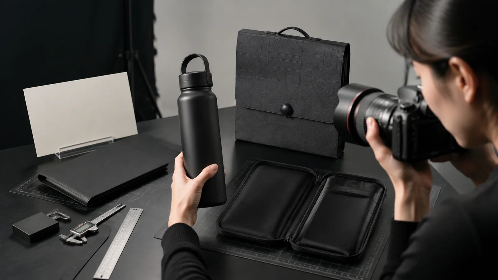
Each rung answers a different question. A drawing describes intended location. Blank-product photographs reveal construction. A rendering communicates artwork orientation. Production review tests feasibility. Physical evidence tests whether the chosen placement survives real use. No single rung proves all five.
For international programmes, retain the placement card and evidence with the order record so regional teams do not reinterpret “front” or “centred” from separate images. LUGVO can help buyers turn these placement decisions into production-ready gift programmes, while its corporate gifting services support the sourcing and coordination needed to keep the approved logic attached to the correct product and supplier.
The final placement should be the one that survives the product's life, not the one that looks most convenient in a mock-up. When viewer, state, surface, datum, keep-outs and evidence agree, the logo has been designed for real use.


 English
 Español
 Français
 العربية
 Italiano
 Deutsch
 日本語
 Nederlands
 Svenska
 Norsk bokmål
 Dansk
 Suomi
 한국어
 Ελληνικά
 עִבְרִית
 Română
 Türkçe
 Русский