
Logo colour matching for promotional products starts by accepting an awkward fact: one brand colour will not look identical on cotton, coated metal, recycled plastic and printed card. The useful objective is not to force every material towards an impossible digital value. It is to define the correct physical reference for each application, agree how it will be viewed, approve an achievable production result and record a tolerance that can be checked again.
That method prevents two common failures. A supplier is no longer asked to “match the logo blue” without a usable target, and a brand team is no longer surprised when an approved screen image changes on a textured or reflective product. Colour control becomes a set of deliberate production decisions rather than a debate based on photographs and memory.
One colour, four surfaces
Consider a launch kit containing a cotton tote, a powder-coated bottle, a moulded cable organiser and a coated paper sleeve. The artwork uses the same blue in every file. Under office lighting, the tote looks softer, the bottle appears deeper, the plastic is slightly greyer and the sleeve is brighter.
None of those observations proves that production failed. The materials interact with light differently. The tote has fibres and texture. The bottle may have gloss or metallic influence beneath the decoration. Recycled plastic can contain visible variation. The paper’s coating changes ink appearance. A phone photograph adds another camera, display and viewing environment to the chain.
The decision should therefore be made application by application:
- Which physical or measured reference controls this item?
- Is the brand colour achievable with the selected material and process?
- Which difference would a recipient actually notice in normal use?
- What evidence will let another production run reproduce the approval?
This is narrower than choosing a decoration technology. The comparison of branded merchandise decoration methods helps select screen print, embroidery, transfer, sublimation, pad print or engraving. Colour approval begins after the feasible process is known.
Define the target before the supplier matches it
A hex, RGB or CMYK value is useful in the right workflow, but it is not a universal physical colour instruction. Screen values depend on devices and settings. Process-colour output depends on inks, profiles, substrate and equipment. Even a named spot colour needs the correct colour system, material reference and finish.
Pantone explains that its graphics and Fashion, Home + Interiors systems serve different materials and production needs. That distinction matters in merchandise. A coated-paper reference should not automatically govern dyed textile, moulded plastic and painted metal as if they were the same surface.
Use a reference hierarchy:
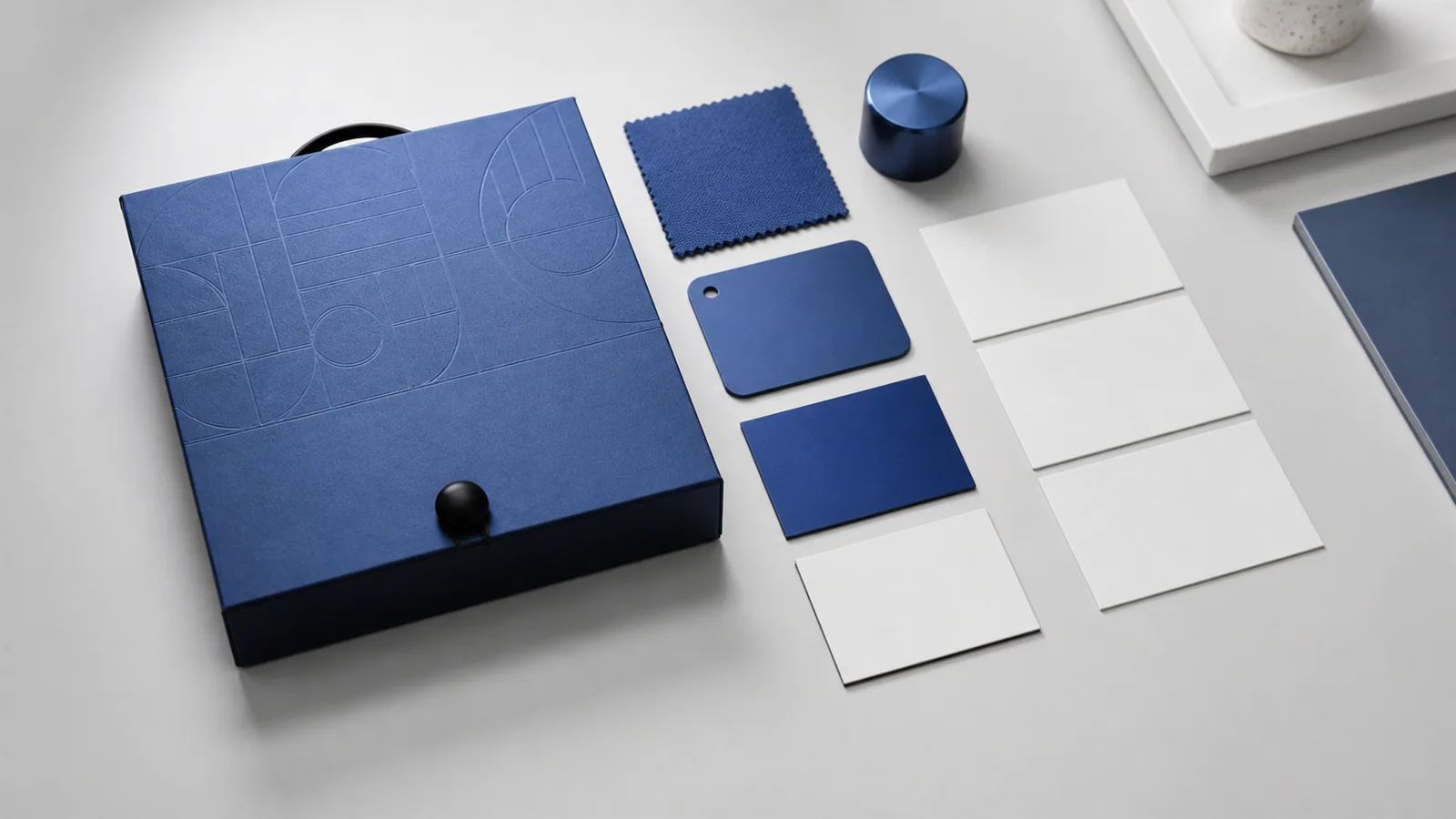
- Approved physical master for the actual item. This is the strongest production reference once signed and protected.
- Current physical colour standard for the relevant material system. Record the guide, code, finish and edition or issue where applicable.
- Measured values and conditions. Useful for process control when the instrument, geometry, illuminant and calculation are defined.
- Controlled proof or supplier sample. Useful only when its material and process represent production.
- Digital artwork values. Keep these for file integrity, not as proof that every physical surface must look identical.
If no physical master exists, the first sample round should establish one. Both parties sign or photograph the sample with an ID, date, product, substrate, process and finish. “Blue approved” is not enough.
Separate substrate from process
Buyers often diagnose every colour difference as an ink-mixing problem. Sometimes the substrate is the larger cause. Write both variables into the approval record.
| Application | Colour variables to expose | Useful approval evidence |
|---|---|---|
| Cotton or polyester textile | fibre, base colour, weave, pretreatment, ink or thread, curing | strike-off or sew-out on production fabric; washed sample where relevant |
| Coated metal | coating colour and gloss, surface preparation, ink opacity, curing | decorated production-equivalent body under agreed light |
| Moulded plastic | resin, recycled content, masterbatch, texture, wall thickness | moulded chip or actual component from the intended formulation |
| Paper packaging | coated or uncoated stock, ink system, varnish, lamination | press proof or production sample with final finish |
Textiles need a wearable decision
Thread can create a dimensional highlight and shadow that flat ink does not. Screen print can be influenced by fabric colour and ink opacity. Sublimation relies on a suitable substrate and becomes part of the surface rather than sitting on top of it. Approve the actual fabric colour, weight and construction—not a loose swatch with no link to the garment.
Hard goods expose finish and geometry
Gloss, satin and matt finishes can make the same hue feel different. Curved surfaces also catch light unevenly. Judge the mark at the intended size and position on the product. A flat printed proof cannot predict every reflection on a cylindrical bottle.
Plastics require formulation discipline
Do not approve a generic resin chip if production will use a different recycled-content blend or texture. If natural variation is expected, ask for an acceptable range represented by more than one sample. A sustainability claim and a tight cosmetic tolerance may conflict; procurement should record which requirement takes priority and what variability has been accepted.
Packaging changes after finishing
Lamination, varnish, foil and embossing can alter perceived colour or its surrounding contrast. Approve the finished construction. If the pack will be viewed beside the product, assess them together rather than in separate supplier rooms.
Approve under controlled conditions
Two people can disagree honestly when one looks beside a window and the other under warm warehouse light. For critical print comparison, ISO 3664:2025 specifies viewing conditions for reflective and transmissive media. A merchandise programme does not need to pretend every object falls inside that standard’s scope. It can borrow the discipline: define the comparison environment, keep it consistent and record exceptions.
Set one critical approval station with neutral surroundings, controlled illumination and enough time for the viewer to adapt. Compare the production sample with the correct physical reference in the same plane. Then perform a practical-use check under the lighting likely to matter—a retail counter, conference hall, office or daylight-adjacent workspace. Critical and practical viewing answer different questions.
Do not approve from a supplier’s compressed messaging-app image. Photographs can document sample identity and obvious placement, but camera exposure, white balance, compression and screen rendering make them weak colour evidence. If a remote team must decide, courier matched references to both sides or use a qualified measurement workflow linked to retained physical samples.
Instrumentation can improve repeatability, particularly in printing. ISO 13655:2017 covers spectral measurement and colourimetric computation for graphic-arts images. Its scope is not a blanket specification for every textile, coating or moulded part. Use the measurement method appropriate to the material and process, and record the instrument and conditions rather than copying one number across incompatible surfaces.
Write a tolerance that can be inspected
“As close as possible” cannot release production. Neither can an isolated numerical limit chosen without testing whether the process can achieve it and whether the difference is visually meaningful.
Write the tolerance in three layers:
Reference. Identify the approved master, product revision, colour system or measured target.
Evaluation. State the viewing conditions, measurement method where used, sample locations and number of pieces checked. A logo with a gradient or several inks may need separate control points.
Decision. Describe acceptable appearance, measurable boundary where appropriate and automatic rejection conditions. Those might include a visibly different hue family, inconsistent colour within one order, poor opacity, contamination, excessive substrate show-through or a finish that changes the intended impression.
Numerical and visual decisions can coexist. A measured value helps detect drift; the signed production-equivalent master confirms whether the complete object looks right. If they disagree, investigate the method, surface and lighting before overriding one with the other.
ה corporate gift sample approval process explains how to connect an approved sample to production controls. For colour, retain at least one protected master with the buyer and one with the supplier when practical.
Carry the reference into repeat production
The launch kit in the opening does not need four objects that look artificially identical. It needs four controlled interpretations of the brand blue. Procurement approves a screen print on the production tote fabric, a spot-colour print on the coated bottle, a defined moulded-plastic range and the finished paper sleeve under the same critical viewing setup. Each item receives its own reference ID and tolerance.
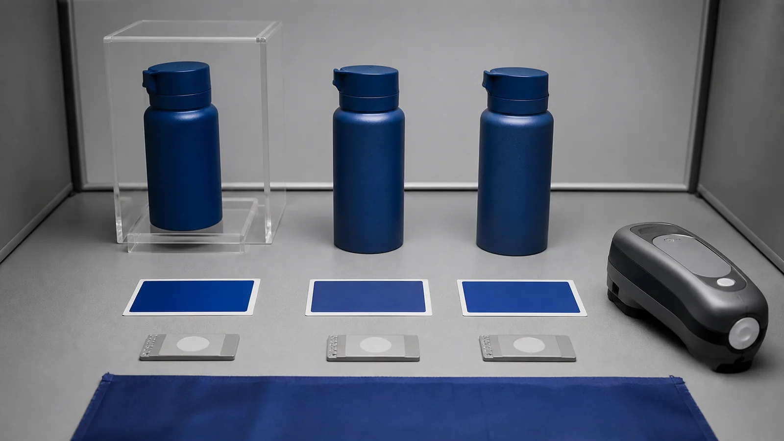
Before a repeat order, confirm the artwork version, product model, material source, base colour, process, supplier site and finish. Ask whether inks, threads, resin, coating, equipment or subcontractors changed. Pull the retained master out of storage and compare it with a fresh pre-production sample; do not approve from memory or the previous invoice.
The release record can remain compact:
- item and production revision;
- artwork file and colour reference;
- substrate, base colour and finish;
- decoration or colouring process;
- approved physical master IDs;
- viewing and measurement conditions;
- tolerance and rejection conditions;
- approver, date and retained-sample location;
- approved deviations and expiry or recheck trigger.
For broader decisions about useful products and restrained branding, the guide to branded merchandise people keep provides the recipient perspective. Colour precision should support a product people will use, not consume the budget while function and durability remain unresolved.
Reliable logo colour matching for promotional products is a chain of evidence: the right target, the real substrate, the production process, controlled viewing, an inspectable tolerance and a retained master. LUGVO corporate gifting services can coordinate product, decoration, samples and packaging around that chain. Share the brand reference, materials, quantity, destinations and required date through the LUGVO services page to request a quote with colour approval built into the production plan.




 English
  Español
  Français
  العربية
  Italiano
  Deutsch
  日本語
日本語  Nederlands
  Svenska
  Norsk bokmål
  Dansk
Dansk  Suomi
Suomi  한국어
한국어  Ελληνικά
  עִבְרִית
  Română
  Türkçe
  Русский